PH WINS Dashboard User Guide
Learn how to use the basic features of the PH WINS Dashboard.
This User Guide explains how to use the dashboard to help answer your research questions about the public health workforce. By the end of this guide, you’ll be able to:
- Navigate and explore data across survey topics and subtopics
- Use filters, comparisons, and download options
- Understand bar graph visualizations
- Find additional resources like survey methods and summary reports
Accessing the Dashboard
The PH WINS national dashboards are publicly available. You do not need an account to access that data.
To view an agency-specific PH WINS data dashboard, you must have an account. If you already have an account, click “Agency Login” at the top of the navigation bar. Your username is your work email address.
If you do not have an account and would like one, please complete the "Gain Access" form. Please note: If you are not the Workforce Champion or Health Official for your agency, you will need permission from either of these individuals to access your agency's data.
Quick Start Guide
Where is the dashboard?
The dashboard can be accessed by clicking “Explore the Data” in the navigation bar at the top of the homepage. This will take you directly to the national dashboard.
How do I view my agency's data?
To view your agency’s data, click “Agency Login” in the navigation bar at the top of the homepage. From there, you can log in to access your agency’s dashboard.
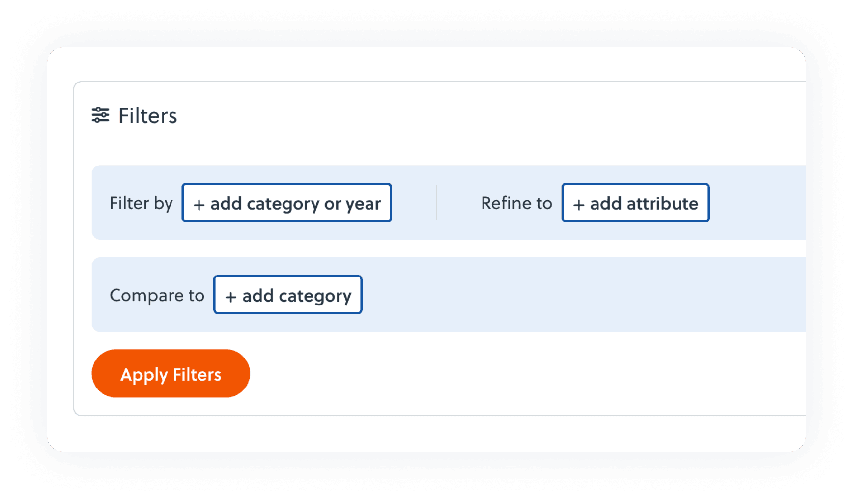
Using Filters
Use the Filter By and Refine To options in the Filters menu to customize the data displayed in each graph.
- Filter By updates all visuals on the topic page to show data broken down by a selected category (e.g., sex or age).
- Refine To restricts the population to a specific group characteristic (e.g., female or 35 and under). You may select up to three characteristics.
See the "Filter By" and "Refine To" section in this guide to learn more.
What information do the Context & Key Takeaways, Survey Questions and Methodology Guide, and Turn Data into Action buttons provide?
Contextprovides a brief description of the topic you're exploring to help frame the data you're viewing, and Key Takeaways highlight important insights — giving you a quick, high-level understanding of what stands out in the results.
The Turn Data into Action buttons links to practical tools, templates, and real-world examples to help you apply insights from the data.
The Behind the Numbers: Survey Questions & Methodology Guide includes information on survey participation, data interpretation, analysis considerations, key updates from the 2021 instrument, and the survey questions and response options associated with each dashboard topic.
The Islands Behind the Numbers: Survey Questions & Methodology Guide, includes information on participation in the PH WINS Islands Pilot, data interpretation, analysis considerations, and the survey questions and response options associated with each dashboard topic.
How can I get technical help?
Click “Support” at the top of the navigation bar to send us a message or to submit a data request for additional analysis.
How can I share this graph?
The graph can be downloaded into a PNG format or PowerPoint format. These options are available below each graph view.
The PNG format will provide an image of the graph. The PowerPoint format will provide a formatted slide that includes the graph’s key takeaway.
Navigation Menu Overview
The navigation bar at the top of the homepage has links to Explore the Data, Resources, About PH WINS, Support, and Agency Login information.
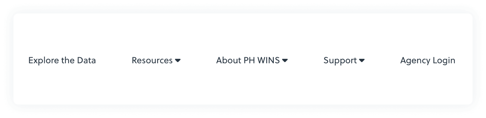
Click Explore the Data to go directly to the data dashboard.
Click Resources to access additional resources to help you interpret or use the data.
Click About PH WINS to learn more about the survey and its history, past findings, and how health departments are using their data.
Click Support to return to this User Guide, send us a message, submit a data request, or to get more information about accessing your agency’s data.
Click “Agency Login” to login to your agency’s data dashboard.
Resources
Explore a variety of resources designed to help you understand and apply PH WINS data. Click any of the resource titles to learn more.
Available resources include:
- Behind the Numbers: Survey Questions & Methodology Guide — Information on participation, data interpretation, analysis considerations, key updates from the 2021 instrument, and survey questions and response options related to each dashboard topic.
- Islands Behind the Numbers: Survey Questions & Methodology Guide — Information on the PH WINS Islands Pilot participation, data interpretation, analysis considerations, and the survey questions and response options related to each dashboard topic.
- Insights to Action — Discover actionable tactics, templates, and examples informed by data-driven insights.
- Summary Reports — Summarize the survey data in one click, review insights, and download slides.
- Key Findings — Explore and share key findings in a visual, digestible format — great for both data novices and experts.
Exploring the data
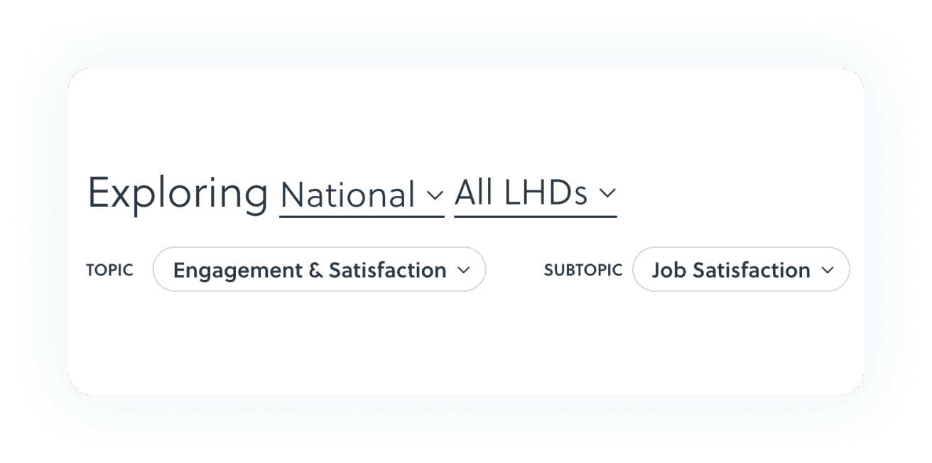
Selecting a Topic and Subtopic
Use the Topic and Subtopic dropdown menus to navigate to different Topic Pages for the population you are currently viewing. By default, the Subtopic dropdown will automatically select the first subtopic listed.
Example: Select TOPIC > Engagement & Satisfaction. Select SUBTOPIC > Job Satisfaction
Key:
* = Only available on the State and Local Dashboard
** = Only available on the Islands Dashboard
Topics and subtopics include:
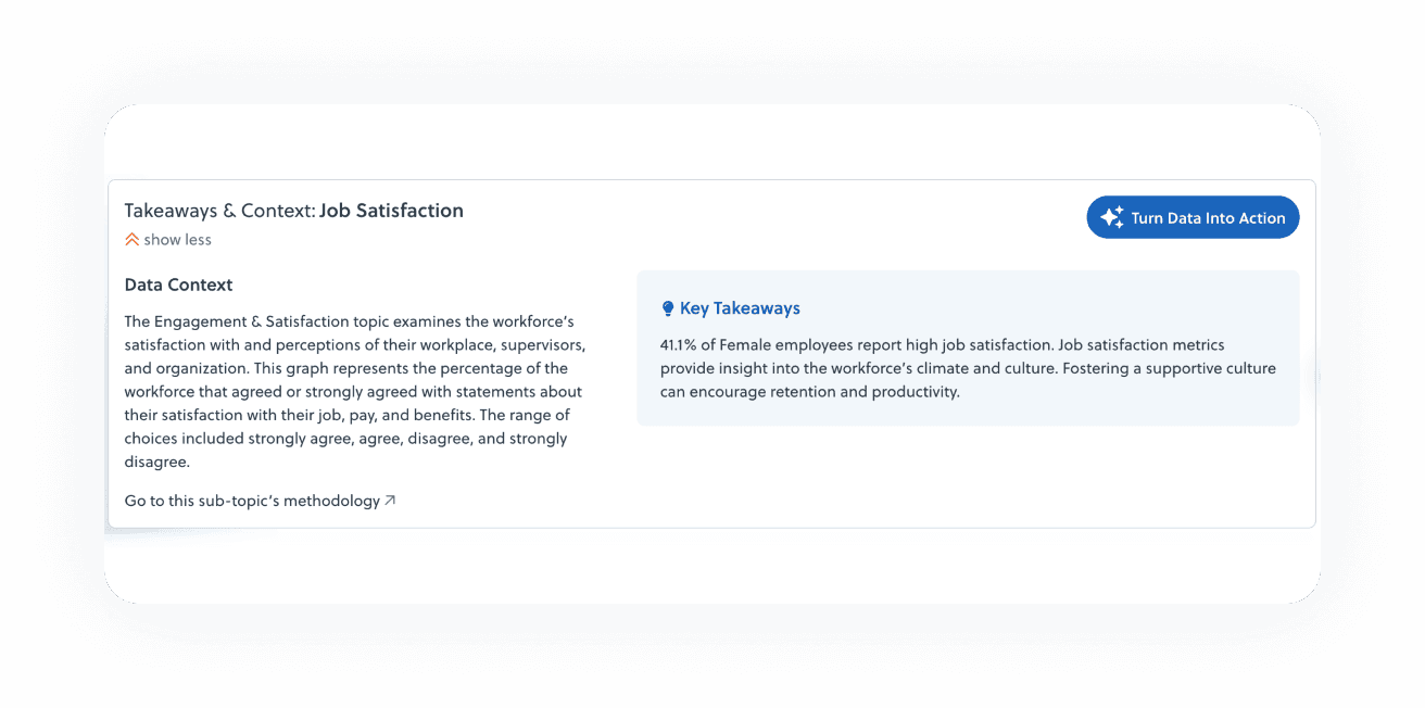
Takeaways, Context, and Turn Data into Action
After selecting a Topic/Subtopic, you’ll see a Takeaways & Context box at the top of the graph. Click Show More to view the full content. This section includes three key elements: Data Context, Key Takeaways, and a Turn Data into Action button.
Data ContextProvides a brief description of the Topic and Subtopic to help frame the data you are viewing.
Key TakeawaysHighlights important insights from the data — giving you a quick, high-level understanding of what stands out in the results.
Turn Data into ActionLinks to practical tactics, templates, and real-world examples — designed to help you apply data-driven insights to support meaningful change.
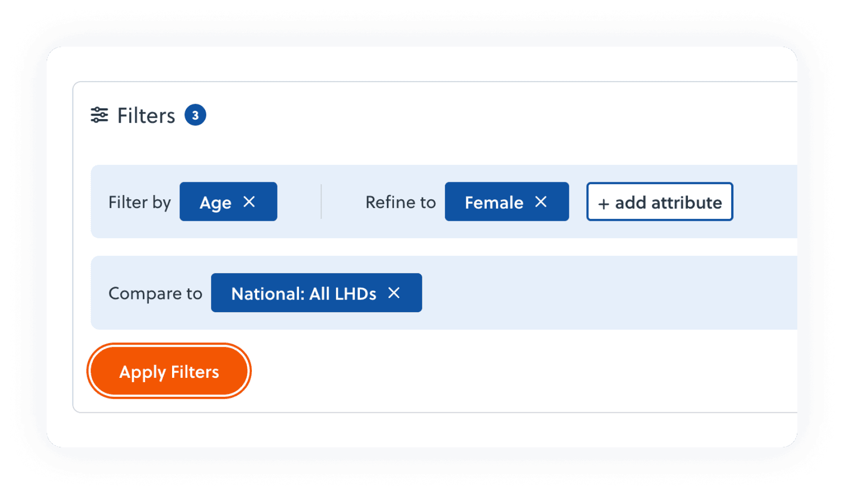
Filters
Filter By
To access filtering options, click the Filters bar above the graph. This will expand the section to show Filter By, Refine To, and Compare To features.
The Filter By dropdown menu allows you to update all graphics on the topic page to display data for a specific group of respondents.
Key:
* = Only available on the State and Local Dashboard
** = Only available on the Islands Dashboard
You can filter data by:
- Age
- Annualized Salary
- Central Office*
- Current Remote Status
- Educational Attainment
- Employee Type*
- Full-time/Part-time*
- Leaving, Retiring, or Staying
- Population Size Served*
- Public Health Training
- Race & Ethnicity*
- Rurality*
- Sex
- Staff Size*
- Supervisory Status
- Tenure in Agency
- Union Position*
- Year*
Refine To
The Refine To option allows you to focus exclusively on a specific group within the dataset. When you select a category under Refine To, the population you are viewing will be restricted to the characteristics you selected.
For example:
- If you filter by Sex, you can view data broken out by female and male.
- If you refine to Female, the graph will display data only for females.
Key:
* = Only available on the State and Local Dashboard
** = Only available on the Islands Dashboard
Compare To
Use the Compare To dropdown menu to compare data in the graphs to another population. The options are preselected based on the population you are currently viewing.
Graph Features
Titles
The graph will display a small title based on the selected Subtopic, Filter By or Refine To option, and comparison group.
Vertical Axis Labels
Vertical Axis Labels represent the categories reflected in the Subtopic. If a Filter By option is selected, the vertical axis labels will update to reflect the Filter By categories and the previous vertical axis label will appear in the graph’s legend.
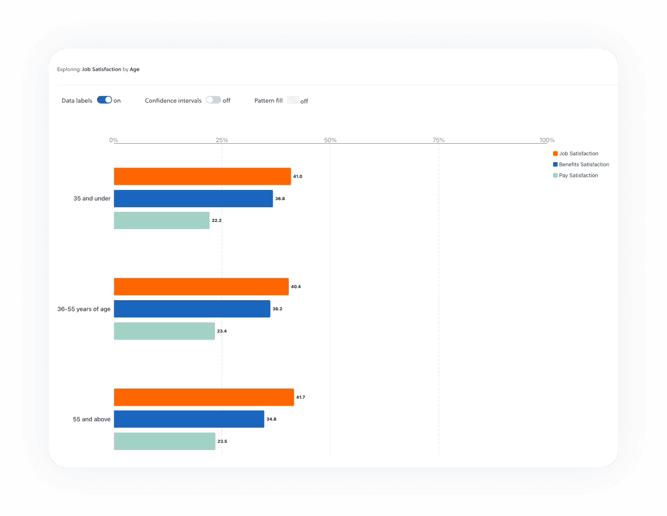
Data Labels
Data Labels, which appear at the end of each bar in a graph, represent the percentage or point estimate for each available piece of data shown in the graph.
Confidence Intervals
Use the Confidence Intervals toggle to turn on the 95% confidence intervals around the point estimate. By default, Confidence Interval markers are turned off. If viewing a graph, the confidence intervals will appear as small line markers at the end of each graph. If viewing a table, the confidence interval values will appear directly in the table.
Table View Option
To the right of the graph, click the View Table button to display the data in table format.
Collapsed Graphs
If you only see a characteristic labeled as “Combined View”, it means that the full version did not meet the minimum reporting threshold and the data have been grouped together. This approach helps protect respondent privacy while still allowing agencies to analyze workforce trends. By applying these data suppression and grouping rules, PH WINS maintains data integrity and continues to provide meaningful insights to support workforce development.
Suppressed Graphs
To protect respondent confidentiality and ensure data reliability, suppression rules have been applied to the survey results. If a graph is suppressed, the following message will appear: Data is not shown because of insufficient responses. This means that the reporting categories have fewer than 10 total responses. Filter By and Refine To options that do not meet this criteria will also be suppressed and not available in those menus.
Filtering Criteria: Filters that meet the suppression criteria will not be available.
Download the Graph or the Data
You can download data for a single graph, download all dashboard data at once, or download data based on selected filters. Use the Download All Data (XLSX) button above the graph to download all the data for the selected population. Use the download buttons below the graph to download a PNG or PowerPoint slide of the graph, a Comma Separated Values (.csv) file containing data for the graph you are viewing, or an Excel (.xlsx) file containing all data associated with your selected filters.
Download All Data (XLSX)Use the Download All Data (XLSX) button at the top right of the dashboard to download a Microsoft Excel (.xlsx) file containing all available data across topics and subtopics for your selected population. This file includes the full dataset behind the dashboard, allowing you to explore multiple topics at once without needing to download each graph individually. After clicking the button, a message will appear indicating that your download is being prepared. Please keep the page open and do not refresh until the download begins. Check your computer’s Downloads folder for the file.
Download Filtered Data (XLSX)Use the Download Filtered Data (XLSX) button below the graph to download a Microsoft Excel (.xlsx) file containing all available data based on the filters you have applied. This download reflects any selections made using the Filter by and Refine to options and includes data across topics and subtopics for the selected population. The download may take up to 10 minutes to complete. When the file is ready, it can be downloaded from the Filtered Data Downloads section of the page below the graph. The Filtered Data Downloads section can hold up to five downloads at a time
Note: This feature applies only to the Filter by and Refine to options. It does not apply to selections made using the Compare to feature
Download the Data (CSV)Use the CSV button to download a Comma Separated Values (.csv) file containing data for the graph you are viewing. Check your computer’s Downloads folder for the file. You can open .csv files in Microsoft Excel or similar programs and use them to create your own custom tables and graphs.
Download the Graph (PNG)Use the PNG button to download a Portable Network Graphic (.png) file for the graph you are viewing. The PNG format will provide an image of the graph.
Download the Graph (PowerPoint)Use the PowerPoint button to download a formatted slide that includes the graph’s key takeaway.
Other Features
Reset Menus
Use the X button next to each selected option to clear your choices in the Filter By, Refine To, or Compare To Menus.
Citation
Copy and paste the Citation text into your reports, presentations, and other materials that include or reference data from the PH WINS Dashboard.
Password Protected Dashboard Details
The information below highlights elements that are only available on password-protected dashboards.
Refine to; Division
The Refine To option allows you to focus exclusively on a specific group within the dataset. When you select a category under Refine To, the population you are viewing will be restricted to the characteristics you selected.
In addition to the standard Refine To categories on the national dashboard, agencies may also have the ability to refine their data by division, if the following criteria are met:
- The agency submitted division information as part of its staff list, and
- The division had at least 25 employees listed, and
- The division received at least 15 survey responses
Group Dashboards
Some agencies may have access to a group dashboard, which combines data from local health departments within a state.
If subpopulations are available in your group dashboard, you will see them listed in the Subpopulation dropdown menu. Not all group dashboards include subpopulations.
To find out which group your agency is included in, click here.